
Your logo might be doing its job. But can it do every job?
You've got a logo. Great! You put it on your website, your business cards, your social media, maybe even a T-shirt or two. But then you try to squeeze it into a tiny Instagram profile picture, put it on a promotional banner, or use it on a document where the proportions just don't cooperate.
Suddenly, that one logo isn't looking quite so versatile.
Here's the thing: A good logo should be recognizable. A great brand identity should be adaptable.
Your business doesn't exist in just one place, so why should your visual identity be limited to one design?
Whether you're starting a new business, refreshing an outdated identity, or finally investing in professional branding, having multiple logo variations is an important part of creating a consistent brand experience.
Let's break down the four essential logo variations every business should consider, what makes each one different, and where to use them.
What’s a Logo Variation, and Why Does Your Business Need Them?
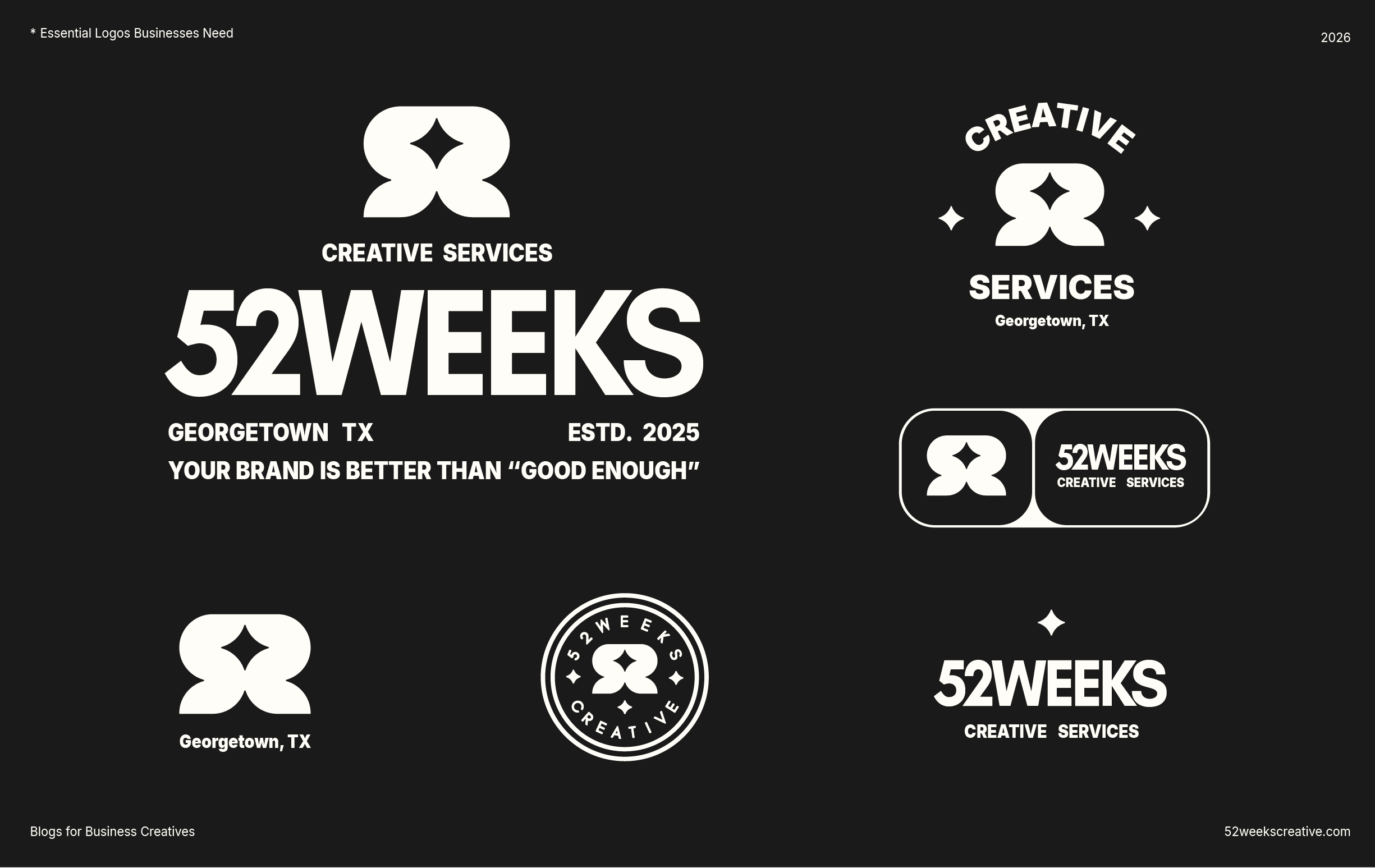
Logo variations are different arrangements or adaptations of a primary logo, designed to work across different sizes, spaces, and applications while maintaining a consistent brand identity.
Think of them as different tools in the same toolbox. They each have a purpose, but they all work together.
Your primary logo might look fantastic across the top of your website, but that doesn't mean it's going to work as a tiny social media icon. Likewise, a small monogram might look great on a hat but feel a little underwhelming on the side of your storefront.
You need options.
Without a collection of complementary logo variations, businesses often end up improvising. Stretching logos, rearranging elements, changing proportions, or creating entirely new versions every time a new design challenge comes along.
And that's how visual inconsistency starts creeping into your brand.
A well-developed logo system gives your business the flexibility to show up consistently across:
Websites and digital platforms
Social media profiles and advertisements
Business cards and stationery
Packaging and product labels
Promotional materials and signage
Merchandise, apparel, and branded products
Presentations and business documents
The goal isn't to have four completely different logos. It's to create a cohesive family of designs that work together to make your business recognizable wherever people encounter it.
Let's meet the family.
1. The Primary Logo:
Your Brand's First Handshake
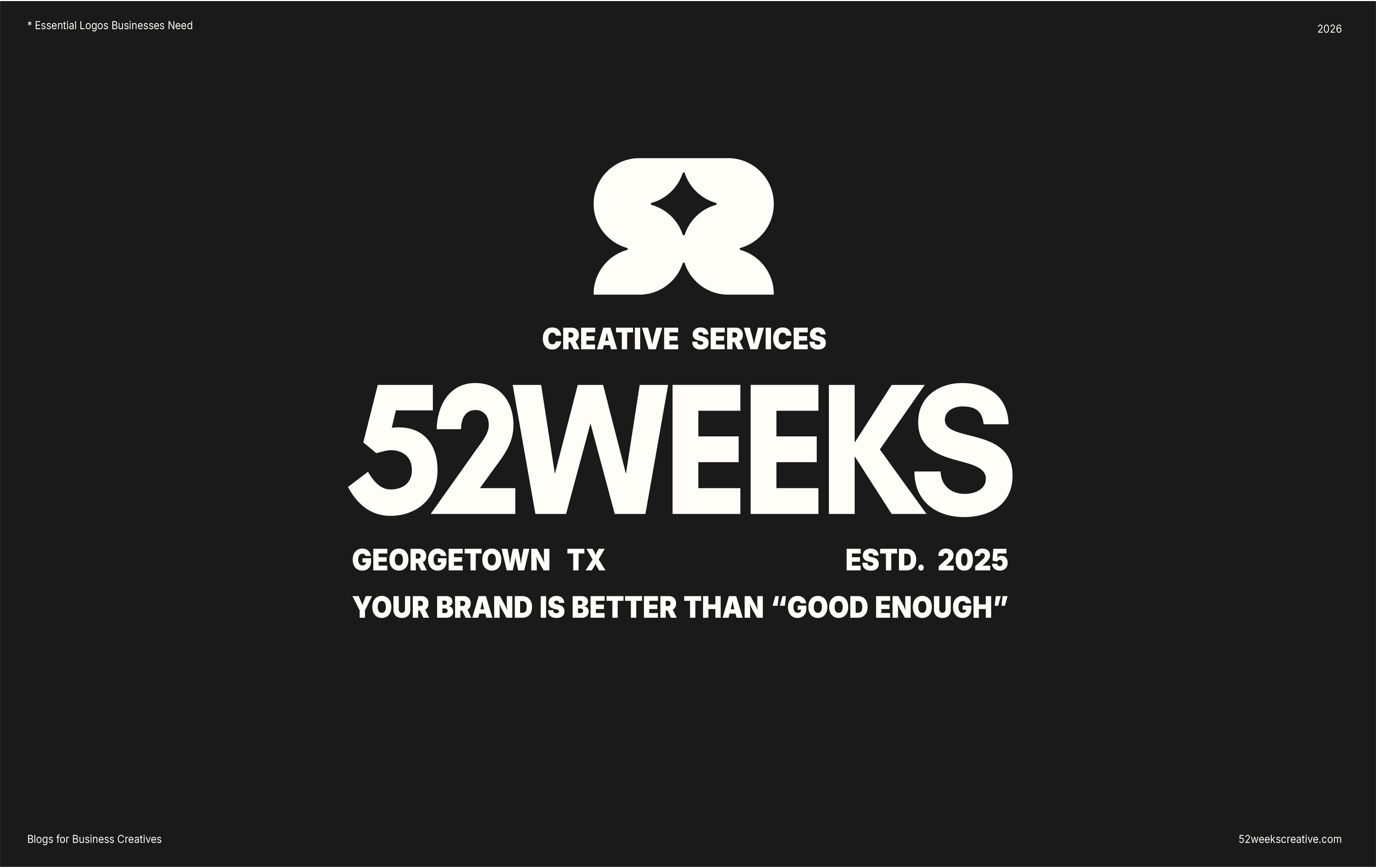
Your primary logo is the main visual representation of your business. It's typically the most recognizable and comprehensive version of your logo design.
This is the one people will most frequently associate with your company.
A primary logo might include your business name, a custom symbol, an illustration, a tagline, or other identifying elements. The exact composition depends on your brand's personality, industry, and overall design direction.
Primary logos are often designed horizontally, but that's not a definitive rule. The most important thing is creating a composition that represents your brand effectively and has enough room to breathe.
Where should you use your primary logo?
Website headers
Storefront signage
Large-format print materials
Marketing presentations
Promotional banners
Official company documents
Your primary logo is the foundation of your visual identity. Every other logo variation should feel like it belongs to the same family.
The design takeaway: Don't try to cram everything into your primary logo. A strong logo communicates your identity without needing to tell your entire business story in one little graphic.
2. The Secondary Logo:
Same Personality, Different Outfit
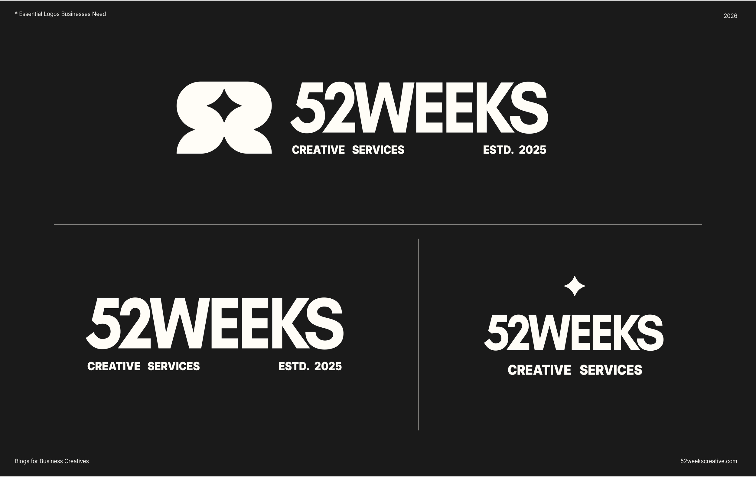
Your secondary logo is an alternate arrangement of your primary logo, designed to accommodate different spaces and layouts.
Think of it as your primary logo's more adaptable sibling.
If your primary logo is horizontal, your secondary logo might be vertically stacked. If your primary logo includes an elaborate illustration or tagline, the secondary version might simplify the composition to focus on your business name.
The important distinction is that a secondary logo isn't a completely different identity. It should maintain the same visual language, typography, and overall personality as your primary logo.
Why does this matter?
Because your business needs to look like the same business everywhere.
You don't want someone visiting your website, receiving your business card, and seeing what looks like three different companies.
Where should you use your secondary logo?
Business cards
Letterheads and invoices
Product packaging
Social media graphics
Promotional materials
Narrow or vertically oriented spaces
The design takeaway: A secondary logo gives you flexibility without sacrificing recognition. It's about finding another way to communicate the same identity, not reinventing it.
3. The Submark: Small Design,
Big Recognition
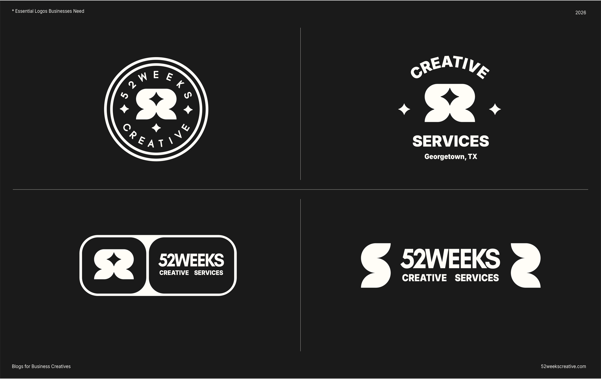
Now we're getting into the fun stuff. This is my personal favorite part of he process, because we get to be really creative!
A submark is a creative, simplified version of your logo, usually designed to fit into smaller or more compact spaces.
Unlike your primary logo, which might contain your full business name and several design elements, a submark focuses on the most recognizable parts of your identity.
This might be:
Your business initials
A custom illustration or symbol
A simplified version of your primary logo
A monogram
A recognizable graphic element from your brand
Submarks are especially useful when your full logo becomes too complicated or difficult to read at smaller sizes.
For example, imagine a business with a beautifully illustrated primary logo featuring its name, a custom character, and several decorative details.
Trying to squeeze all of that into a tiny social media profile image isn't going to do it any favors.
A thoughtfully designed submark solves that problem.
Where should you use your submark?
Instagram and Facebook profile images
Website footers
Mobile website headers
Merchandise and apparel
Stickers and promotional products
Watermarks on photography
Packaging details
The design takeaway: Your submark should be recognizable without needing the entire business name attached to it, but it can still include your business name. The main idea is that the creativity of your brand should stand out more. This is where thoughtful illustration, typography, and simplified design really shine.
4. The Favicon: The Smallest Member of the Family
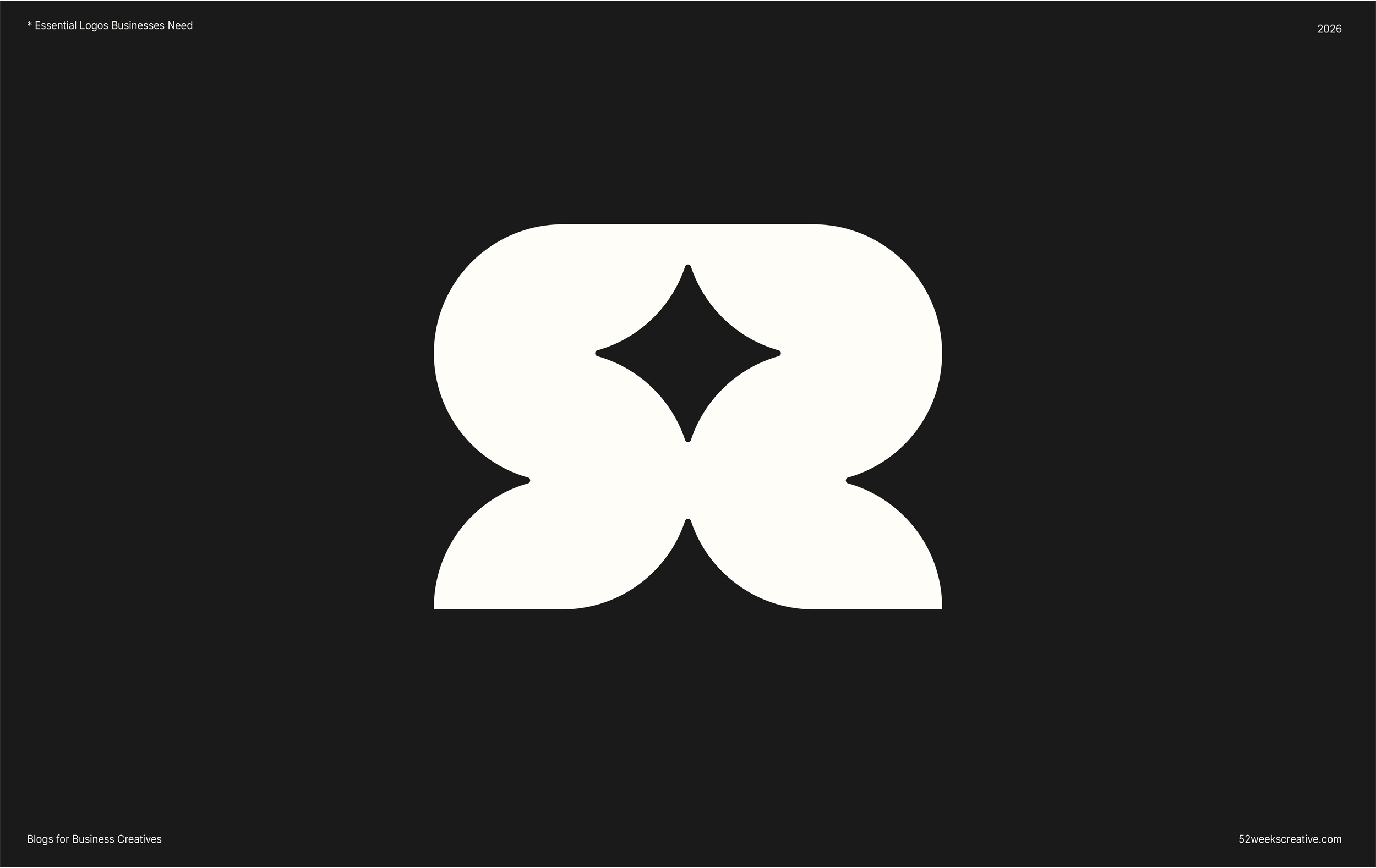
Ever notice those tiny icons sitting next to website names in your browser tabs? You can see mine shining bright right now. Pretty cool, right?
Those are called favicons.
A favicon is a small graphic icon associated with your website. It helps visitors identify your website among multiple open tabs and provides another opportunity to reinforce your brand identity.
It's easy to overlook, but it's one of those small details that makes a website feel complete.
Your favicon is typically derived from your submark or another recognizable brand symbol. Because it appears at such a small size, it needs to be simple, legible, and easy to distinguish. This doesn’t mean you can’t be creative with it. If you look at the one I have currently, I’ve developed a fun 3D version that makes my logo graphic look as if it’s popping out of the tab.
A detailed illustration or full business name probably isn't going to work particularly well when reduced to a tiny browser icon.
Keep it simple.
Where should you use your favicon?
Website browser tabs
Bookmarks
Browser shortcuts
Supported mobile website shortcuts
Other digital applications that display website icons
The design takeaway: A favicon might be small, but it still deserves attention. It's another opportunity to make your brand recognizable, even when people aren't actively looking for it.
How Many Logo Variations Does Your Business Actually Need?
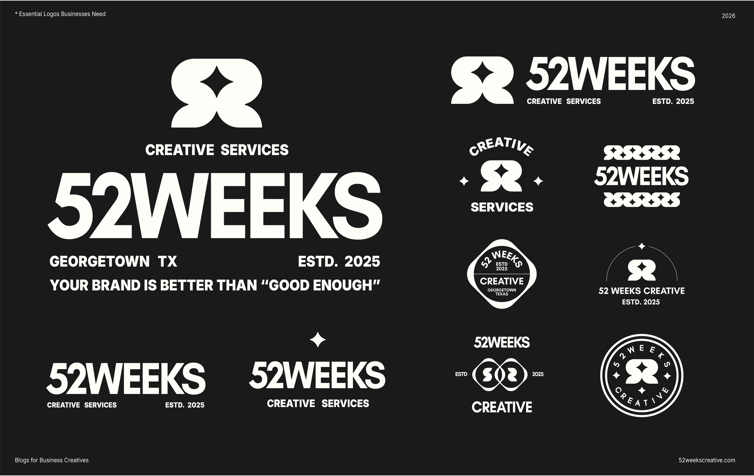
For most businesses, a thoughtfully developed logo system should include these four foundational variations:
Primary logo: Your main brand identifier.
Secondary logo: An alternate arrangement for different layouts.
Submark: A simplified graphic for smaller applications.
Favicon: A tiny digital icon derived from your brand identity.
However, there's no universal rule that every business needs exactly four separate logo designs. Sometimes I create more variations for fun to keep my brand ready for multiple occasions.
At the end of the day, your industry, business model, applications, and overall brand strategy should determine what you actually need.
A restaurant with packaging, menus, signage, uniforms, and merchandise might need a more extensive identity system than a consultant who primarily works through digital platforms.
The goal isn't to collect as many logo variations as possible. Unless your like me… ;)
Ultimately, we are aiming to create a system that makes your business recognizable, consistent, and adaptable wherever it shows up.
Final Takeaway: Your Logo Is the Beginning, Not the Finish Line.
Here's something worth remembering: A logo is not a brand. It's one piece of a much bigger picture.
Your brand is the experience people have with your business. It's what they recognize, what they remember, and ultimately, what makes them choose you over someone else.
A thoughtfully designed logo system helps create that recognition. But it needs to be supported by strategy, consistent messaging, intentional design, and a visual identity that reflects what makes your business worth remembering.
At 52 Weeks Creative, we believe beautiful design should do more than look good. It should solve problems, create connections, and help businesses make a lasting impression.
Whether you're building a brand from scratch or your current identity needs a little (or a lot) of attention, we're here to help bring all the pieces together.
Your business is better than good enough. Let's make sure your branding reflects it.
Need to Hire a Designer? Let’s Chat!
